CODAPPS
Advanced styling of Components
last modified: 2018-03-16
'Escape' or 'o' to see all sides, F11 for full screen, 's' for speaker notes
| this is a pretty intense lesson. You need to be execute the steps precisely for things to work correctly. |
1. Limitations to styling Components in the GUI Builder.
So far, we have learned how to create a Form, how to place Components (text, pictures, buttons) on it and how to get these Components organized on screen.
Using a Span Label, a Scaled Label for the picture and a Button, all in a Box Y Layout, we get this result:
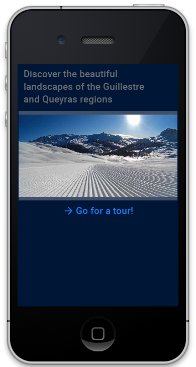
(note: the arrow next to "Go for a tour!" was added thanks to the "Icon" property of the Button, where I selected the pic "arrow" "from Material Icon")
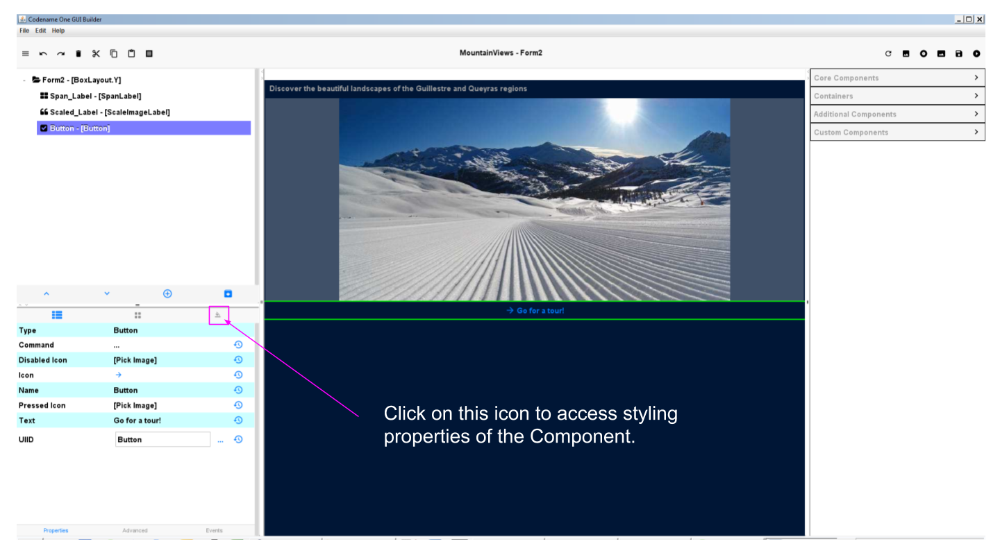
The color of the text of the Button can be changed by accessing the property "Fg Color" available here:
But there are two limitations:
some parameters, even when you choose them in the properties, don’t apply. For the Button, try to select a bold and italic "font name" in the properties: it will not work (the Button will remain as it is).
some parameters are simply not available in the GUI Builder. I’d like to put the phrase "Discover the beautiful landscapes… " at the center of the screen but the properties of the Label in the GUI Builder don’t offer this possibility.
| The GUI Builder is constantly improving. When you will download an updated version of the plugin, things might be fixed! |
When these situations arise, the solution is to work from a different location to apply your styles. Let’s see how:
2. Using theme.res to create a custom style
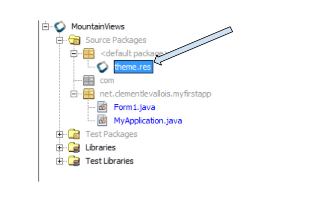
In the files of your project in NetBeans, spot the file named "theme.res". We have already used it to import pictures, in a previous lesson.
Double click on it:
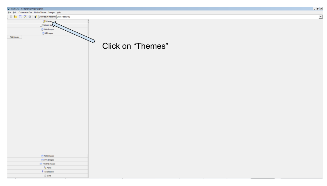
→ It launches a new window. Be patient, it takes a bit of time to open!
Then, click on "Themes":
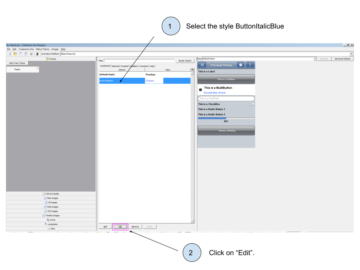
Now double click on "Theme" (not on "Add a Theme") to access the list of all the styles applied by default to your Components:
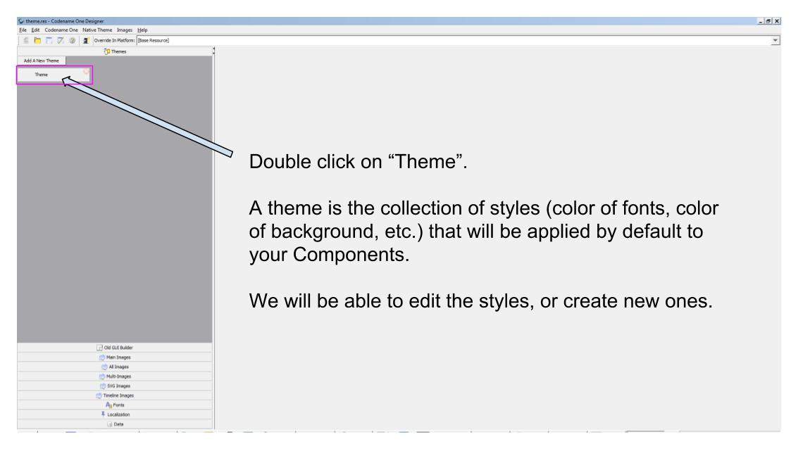
What you see now is the default style of your theme. Select it, and click on "Add" because we want to add a new style for our Buttons
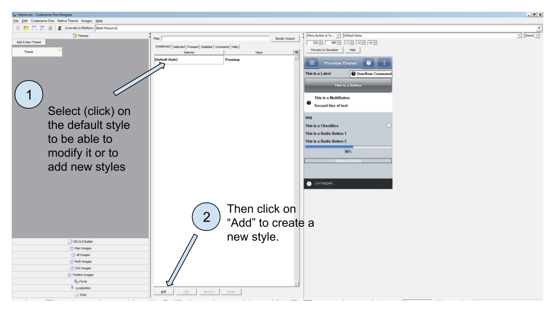
The window which opens now deserves a bit of explanation. In the drop down menu on top, you can see the list of all possible Components:
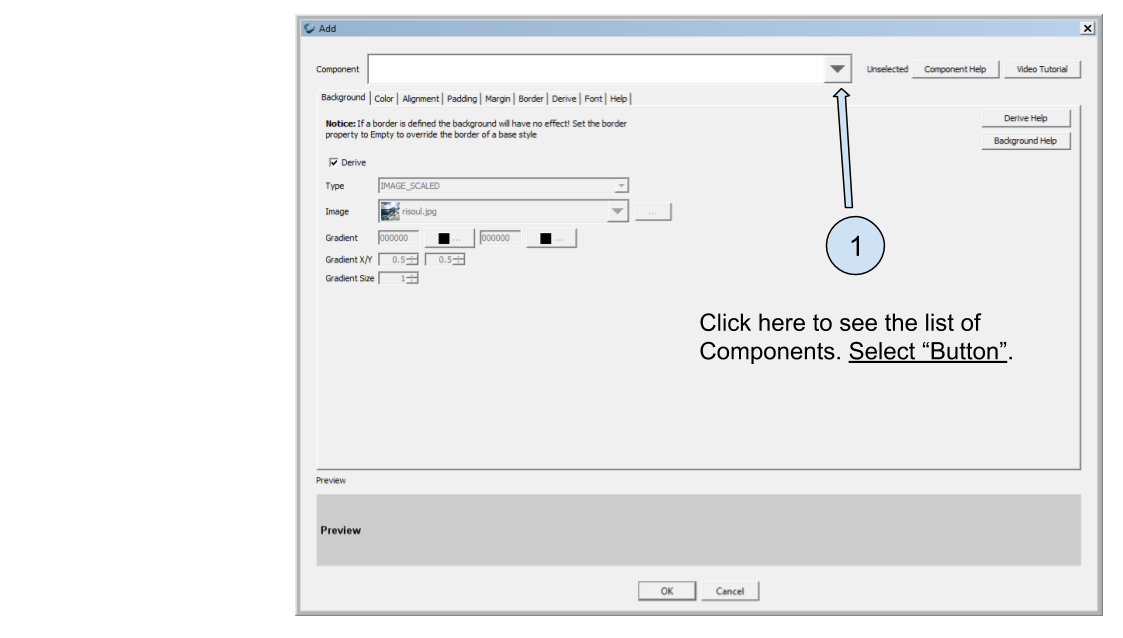
Once you have selected "Button" in the list, you will be able to modify the style of all the Buttons in your app.
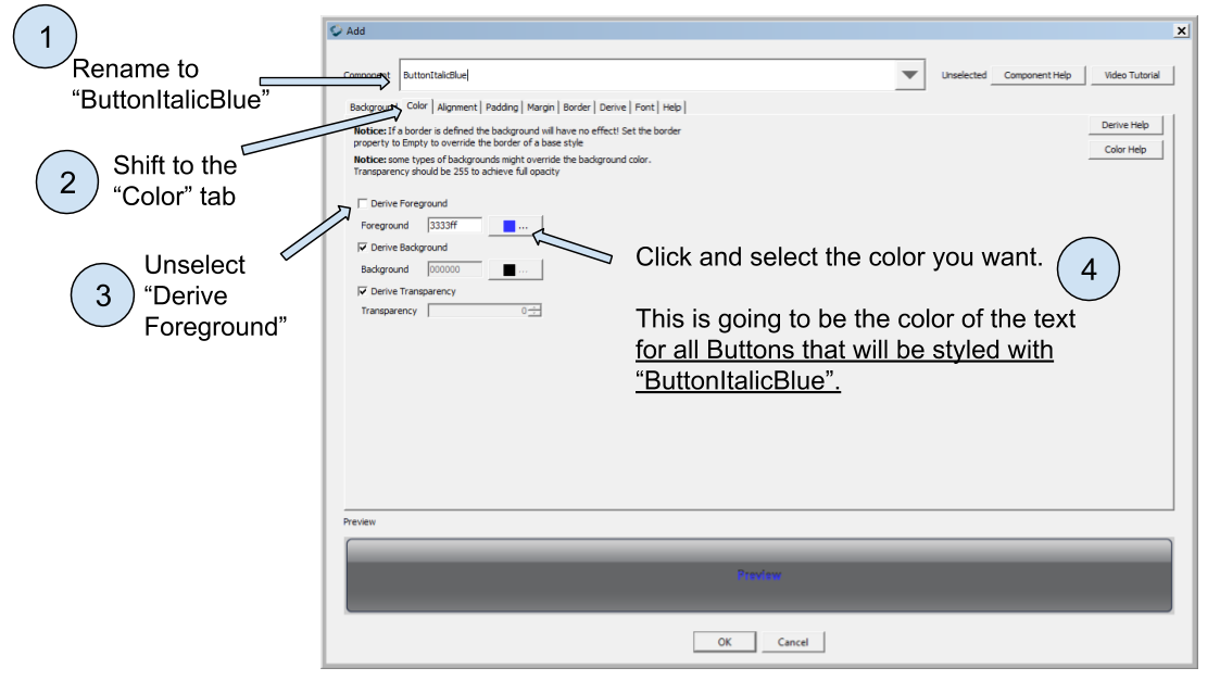
But what you want is slightly different: you want to keep all your Buttons with the default style, but you also want to have just one Button (the one that says "Go for a tour!" - see above) in italic and in a blue color.
How to style this one Button without changing the style of all other Buttons in the rest of your app?
What you need is to:
keep regular Buttons styled without italic or blue color - just the default settings.
add a style named "ButtonItalicBlue" which, when selected in the GUI Builder, will italicize the text of your Buttons and color its text in blue. (random example)
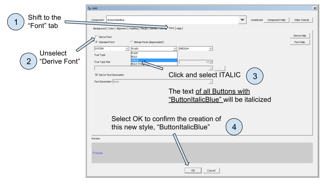
To achieve this, rename "Button" as "ButtonItalicBlue" (careful! no spaces! Don’t forget the capitalized letters!) on top of the window, and start defining this specific style you want:
The logic is simple:
the style of "ButtonItalicBlue" will be the one of a Button, since we selected "Button" in the drop down menu. It is our "starting point".
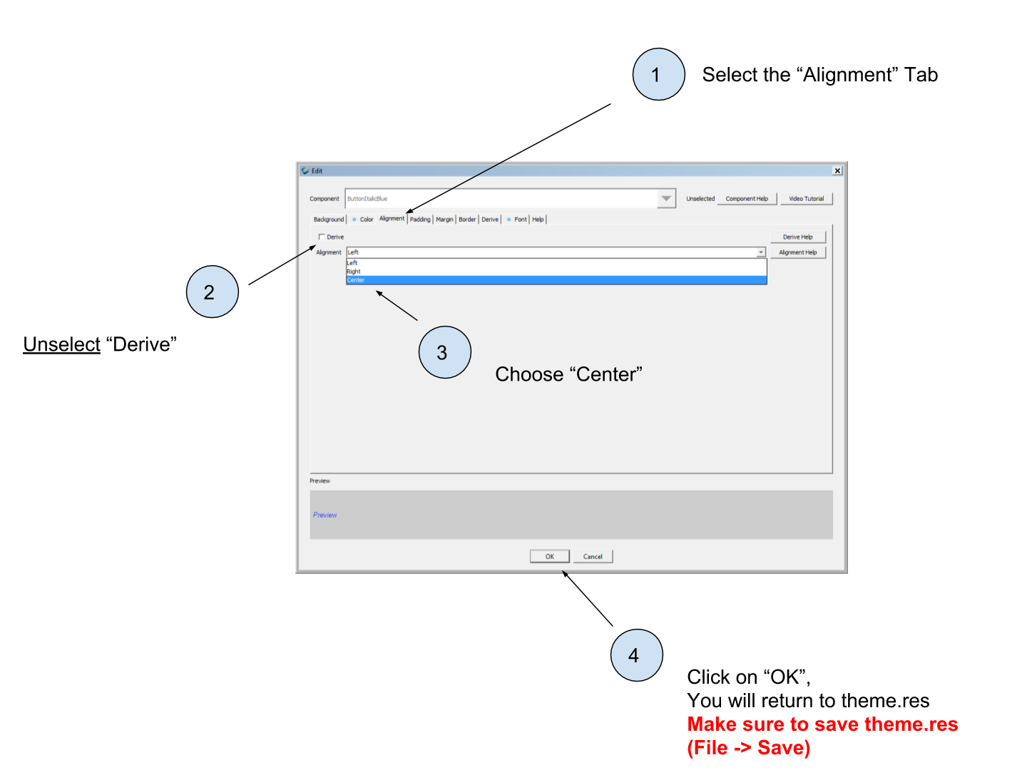
but "ButtonItalicBlue" will differ at every place where we unselect "Derive" and replace the default value by the one we choose.
when we will click on "OK" at the bottom of the window, we’ll have created a new style "ButtonItalicBlue", derived from "Button".
So we have defined a blue color for the text, now let’s make this text italicized:
We closed the window for styling, and we see our new style appearing in the list of available styles:
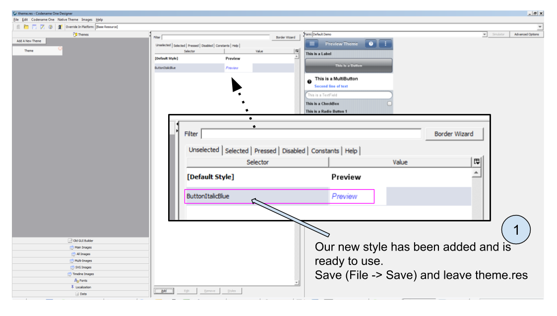
You can leave the window theme.res opened, but make sure you save the changes you just made (File → Save).
(if you don’t save, the GUI Builder will not be able to find and use the new style you created).
We are now ready to come back in the GUI Builder of our Form, and use this style to change the appearance of our button.
3. Using our custom style in the GUI Builder
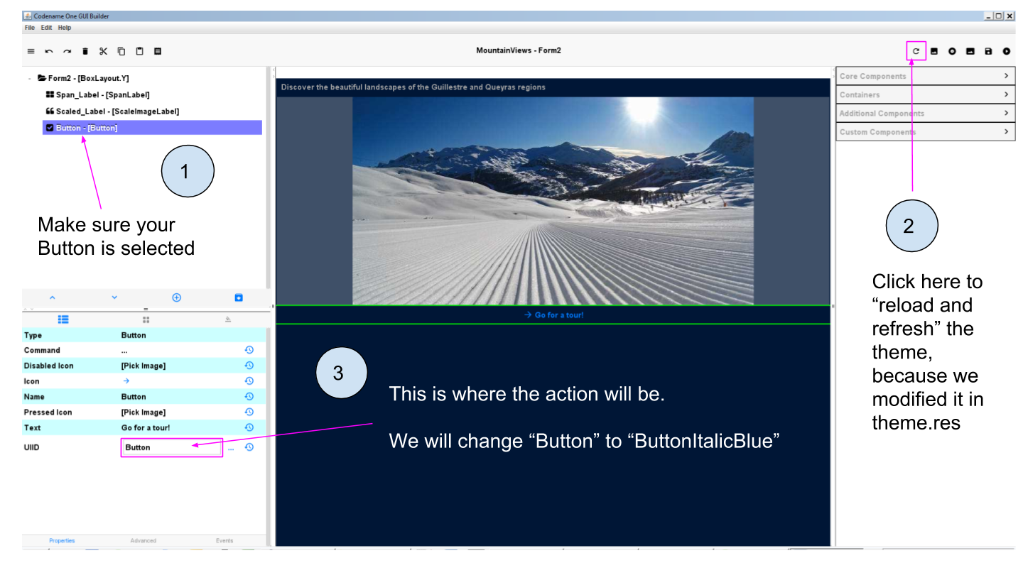
Let’s open our Form in the GUI Builder.
To change the style of our Button to "ButtonItalicBlue" that we just created, we simply need to modify the property "UIID":
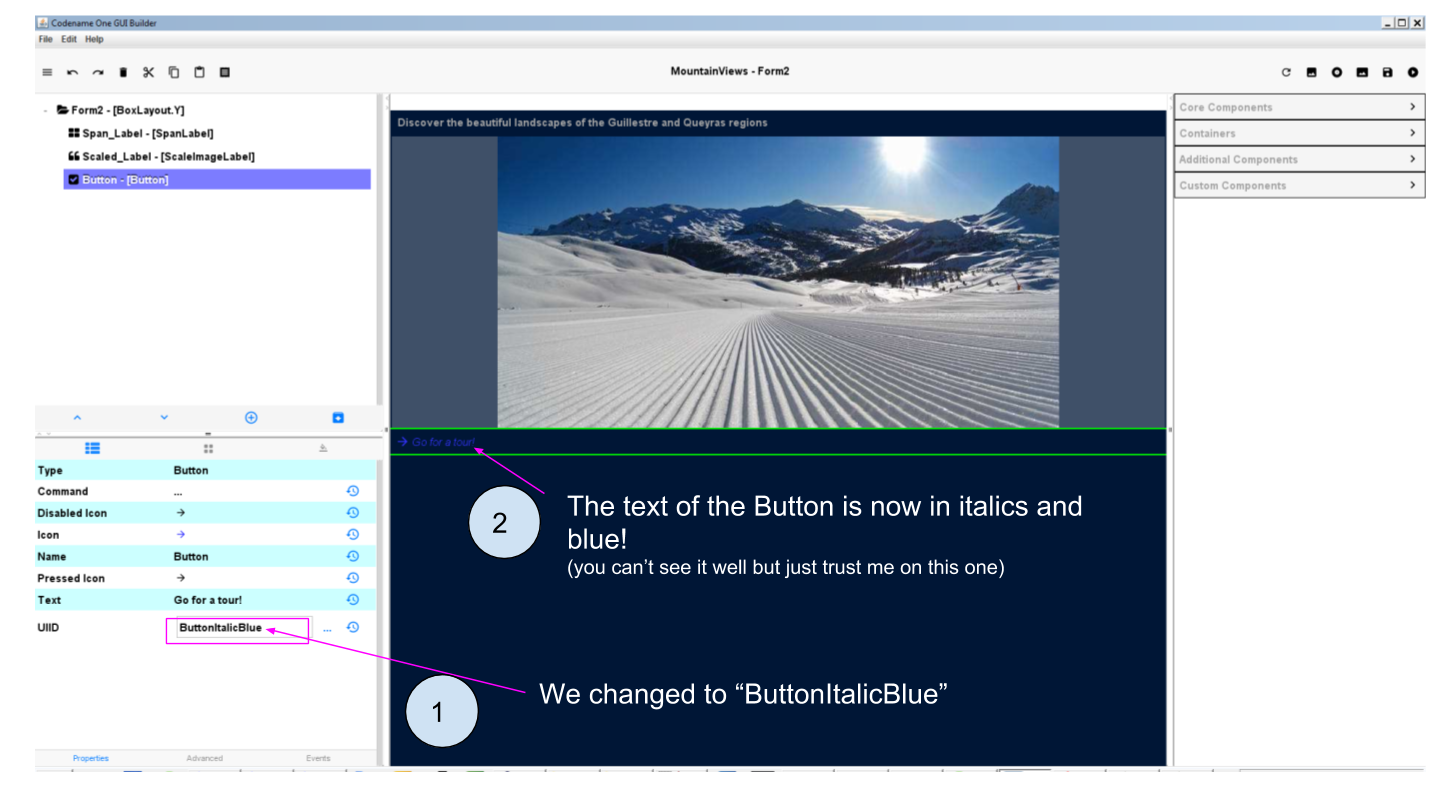
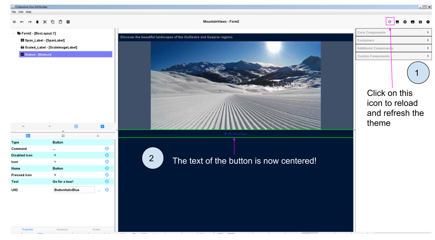
You noticed that a problem occurred: yes, the Button is styled as we want except that the text is now aligned to the left, not centered!
How to fix this?
The basic principle is the same: what you can’t fix in the GUI Builder, you fix it in theme.res
It can be annoying to open theme.res, change styles, close theme.res, open the GUI Builder, then open theme.res again to fix things…
Luckily there is an easy way to work between the GUI Builder and theme.res.
4. Editing styles easily between the GUI Builder and theme.res
The workflow is simple:
Open theme.res and keep it open
Open the GUI Builder and keep it open
modify the style in theme.res. Of course this time we don’t add a new style, we edit ButtonItalic Blue:
A new window opens: the place we have already seen, where you can change many aspects of style.
Again, make sure theme.res is saved. You can keep the window open.
Go back to the GUI Builder and click on an icon near the top right: it will "reload" and apply the modifications you made to theme.res:
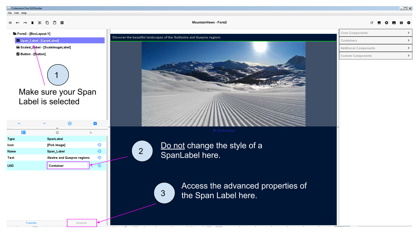
a. The case of Span Labels
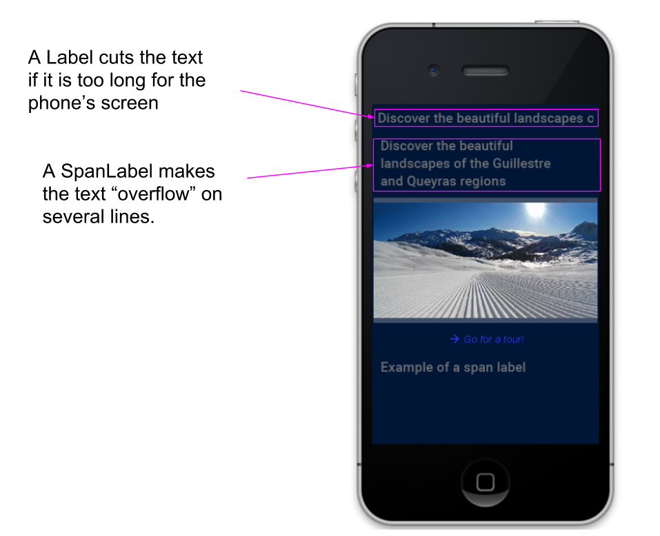
Span Labels or Span buttons are convenient alternatives to Labels and Buttons, because when the text is too long on them it overflows on several lines instead of being cut:
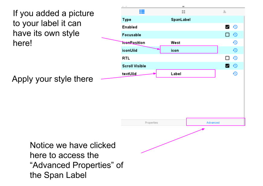
When you want to apply a style that you have created to a Span Label or a Span Button, you should be careful to shift to advanced properties to find the correct UIID property to change:
b. The case of Span Buttons
The same logic as Span Labels apply (see just above): access the "Advanced Properties" of the Span Button to change its "text UIID" property.
The end
Questions? Want to open a discussion on this lesson? Visit the forum here (need a free Github account).
Find references for this lesson, and other lessons, here.
Licence: Creative Commons, Attribution 4.0 International (CC BY 4.0). You are free to:
copy and redistribute the material in any medium or format
Adapt — remix, transform, and build upon the material
⇒ for any purpose, even commercially.
 This course is designed by Clement Levallois.
Discover my other courses in data / tech for business: http://www.clementlevallois.net
Or get in touch via Twitter: @seinecle