Simple Gephi Project from A to Z

2017-01-20

last modified: 2023-04-10

== !

gephi logo 2010 transparent


Gephi workshops

I organize online workshops and personalized trainings for Gephi, for beginners and experts. To schedule one or to get more information: analysis@exploreyourdata.com.

Description of the project

This project is for complete beginners to Gephi. It supposes you have Gephi installed and running on your computer. That is all.

When finishing this tutorial, you should be able to:

  • be familiar with the vocabulary to discuss networks

  • download a network file for this exercise

  • description of the file / the network

  • open a network file

  • read the report after opening a file

  • show the labels of the nodes

  • layout the network

  • visualize attributes of the network

  • prettify the network for enhanced readability

  • compute the centrality of the nodes in the network

  • visualize attributes created by Gephi

  • export a visualization as a picture or pdf

be familiar with the terminology to discuss networks

terminology for networks
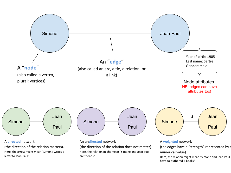
Figure 1. terminology for networks


download a network file

download this zip file and unzip it on your computer.

You should find the file miserables.gexf in it.

Save it in a folder you will remember (or create a folder specially for this small project).

description of the file / the network

This file contains a network representing "who appears next to whom" in the 19th century novel Les Misérables by Victor Hugo[1].

A link between characters A and B means they appeared on the same page or paragraph in the novel.

The file name ends with ".gexf", which just means this is a text file where the network information is stored (name of the characters, their relations, etc.), following some conventions.

open the network in Gephi

  • open Gephi. On the Welcome screen that appears, click on Open Graph File

  • find miserables.gexf on your computer and open it

gephi welcome screen open graph en
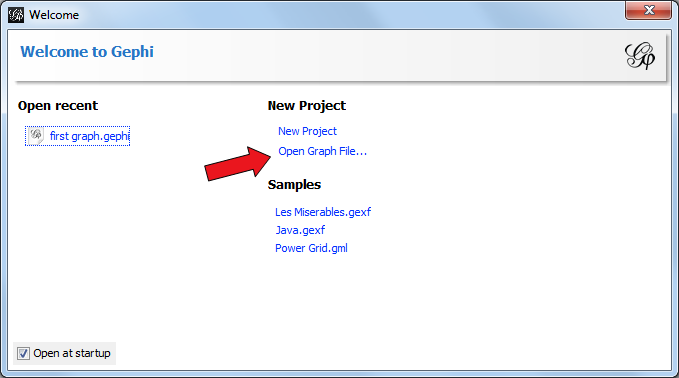
Figure 2. welcome screen


read the report after opening a file

A report window will open, giving you basic info on the network you opened:

opening file report en
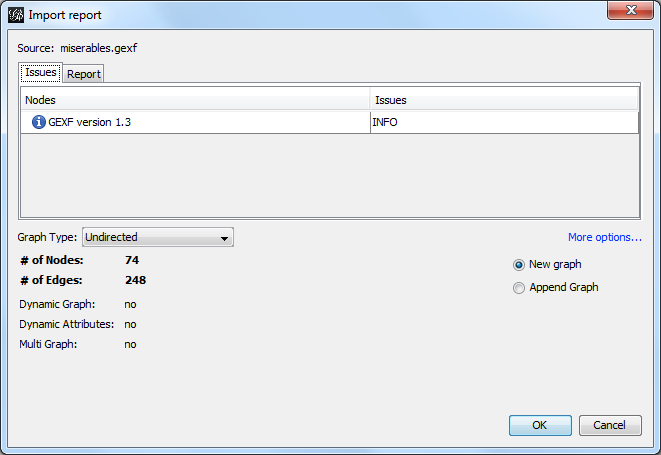
Figure 3. report window


This tells you that the network comprises 74 characters, connected by 248 links.

Links are undirected, meaning that if A is connected to B, then it is the same as B connected to A.

The report also tells us the graph is not dynamic: it means there is no evolution or chronology, it won’t "move in time".

Click on OK to see the graph in Gephi.

initial view

project initial view
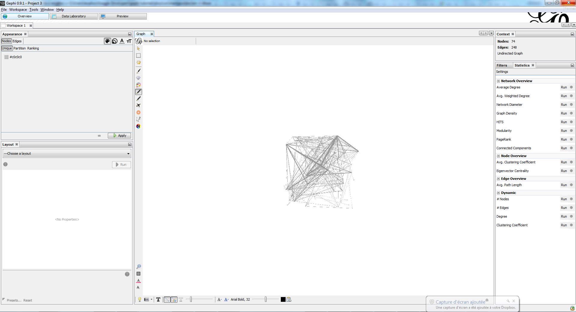
Figure 4. initial view when opening a graph


This is how the network appears in Gephi. Not very useful! Let’s examine what we have here.

basic view of Gephi’s interface

the 3 main screens in Gephi
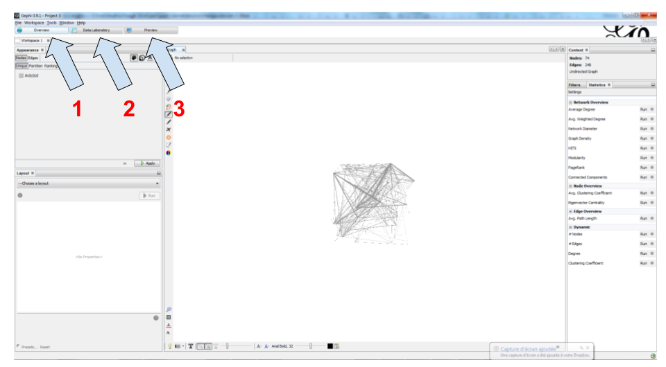
Figure 5. the 3 main screens in Gephi


Gephi has 3 main screens:

  1. Overview: where we can explore the graph visually

  2. Data Laboratory: provides an "Excel" table view of the data in network

  3. Preview: where we polish the visualization before exporting it as a pictue or pdf

What we see here is the Overview.

Filters and statistics panels in Gephi
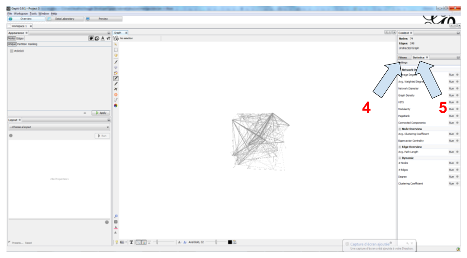
Figure 6. Filters and statistics panels in Gephi


In the Overview, the graph is shown at the center. Around it, several panels help us fine tune the visualization.

  1. "Filters", where we can hide different parts of the network under a variety of conditions

  2. "Statistics", where we can compute metrics on the network

Appearance and layout panels in Gephi
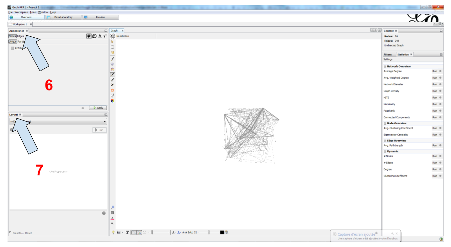
Figure 7. Appearance and layout panels in Gephi


  1. "Appearance", where we can change colors and sizes in interesting ways

  2. "Layouts", where we can apply automated procedures to change the position of the network

3 groups of icons
Figure 8. 3 groups of icons


  1. A series of icons to add / colorize nodes and links manually, by clicking on them

  2. Options and sliders to change the size of all nodes, links, or labels

  3. More options become visible if we click on this little arrow head pointing up

showing labels of the nodes

showing node labels
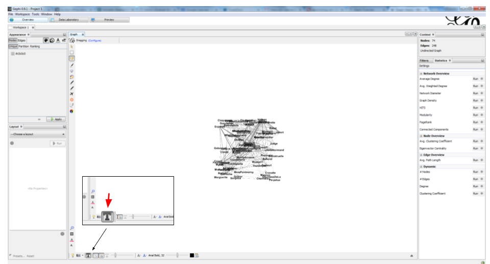
Figure 9. showing node labels


layout ("spatialize") the network

selecting the force atlas 2 layout
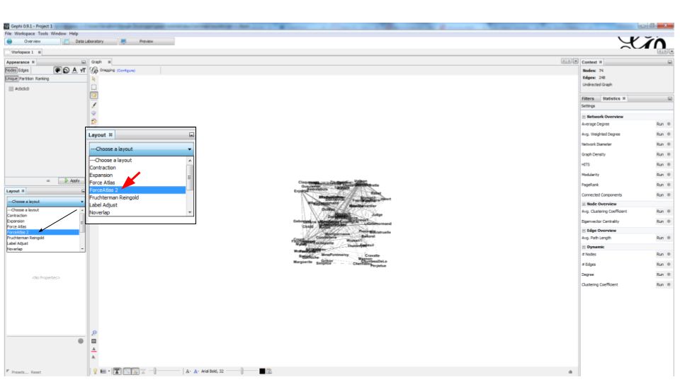
Figure 10. selecting the force atlas 2 layout


changing a few parameters and launching the layout
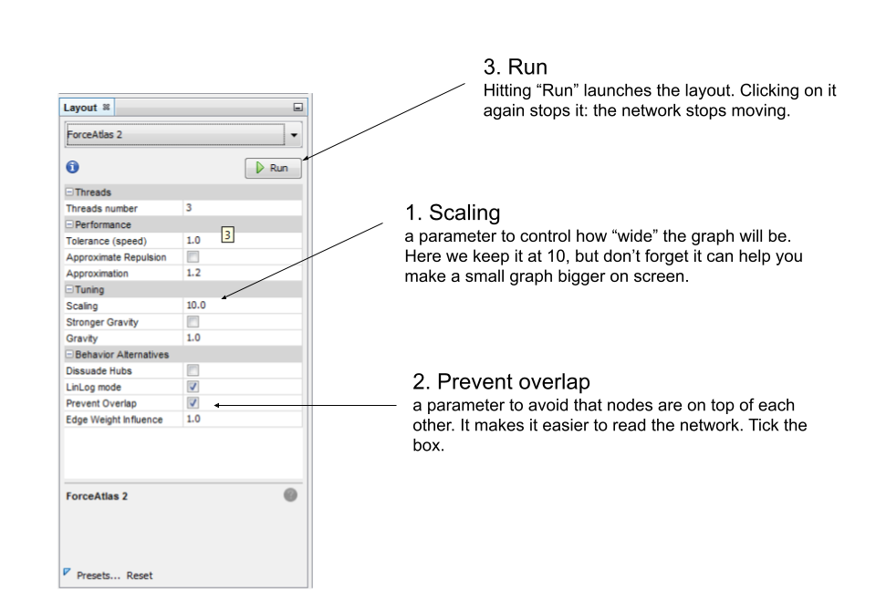
Figure 11. changing a few parameters and launching the layout


result of Force Atlas 2 layout
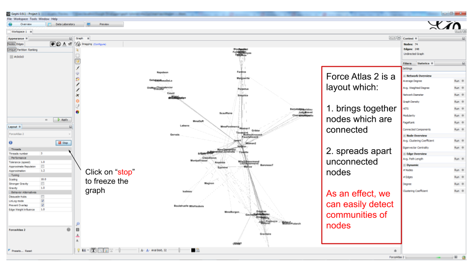
Figure 12. result of Force Atlas 2 layout


visualize the properties of the nodes

A network consists in entities and their relations. This is what we just visualized. Yet, the properties of these entities remain invisible.

For instance: the characters in the novel "Les Misérables" are male or female. Are males more likely to be connected to males, or females? Just looking at the network in Gephi, we can’t tell.

Now, we will see how to make this property ("Gender") visible.

Switching the view to the data laboratory
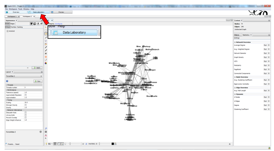
Figure 13. Switching the view to the data laboratory


We see there is a Gender attribute for each character.
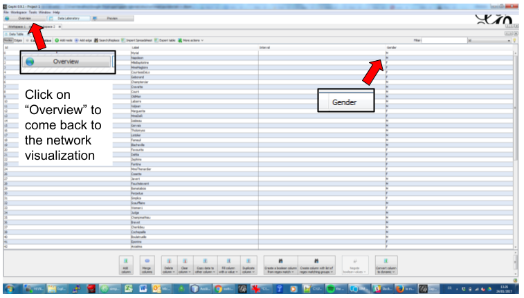
Figure 14. We see there is a Gender attribute for each character.


We will color the nodes based on their gender. To do that, we select Gender in the Appearance panel:

Coloring nodes according to their gender
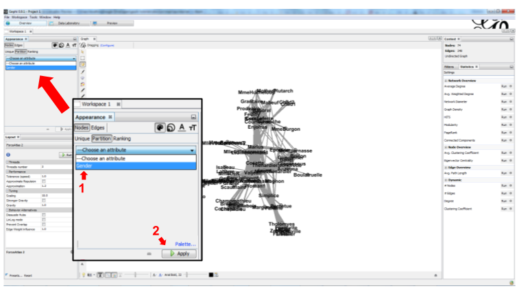
Figure 15. Coloring nodes according to their gender


The result:

appearance miserables result
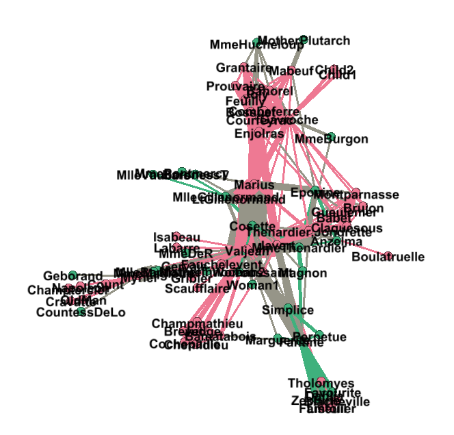
Figure 16. After coloring characters according to their gender


prettify the network for enhanced readability

There are a number of issues with the result we get:

  1. the network is too big or too small, it is hard to read

  2. the labels of the characters overlap

  3. the size of the labels might be too big / small

  4. the links are sometimes too large

Let’s fix these issues.

1. Enlarge or shrink the network

  • either we use the "scaling" parameter of the layout, as we have seen here.

  • or the scale is fine, it is just that we need to zoom it or out. Use the scrolling wheel of your mouse, and right click to move the network.

2. Prevent the Labels from overlapping

In the layout panel, choose "Label Adjust" or "Noverlap": these layouts will move the nodes just so that the Labels stop overlapping:

choosing a label adjust algo en
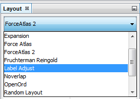
Figure 17. Noverlap or Label Adjust will help you


Don’t forget to click on "Run" to apply these layouts.

3. Changing the size of the labels

Open the bottom panel of Gephi by clicking on tiny arrow head (1). Then select "nodes" (2), then move the slider (3).

Adjusting label size
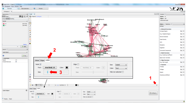
Figure 18. Adjusting label size


4. Adjusting the thickness of the links

Adjusting edge thickness
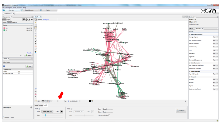
Figure 19. Adjusting edge thickness


computing the centrality of the nodes

1. Definitions of centrality

"Centrality" is a very good metrics to first get an idea of a network. What does centrality mean? Intuitively, we understand that a "central" node will probably sit in the middle of the network. But how to measure that "scientifically", so that we have an objective confirmation of our visual impression?

There are several ways, all equally interesting.

We can measure degree centrality. "Degree" is the technical term for "number of connections that a node has".

So, degree centrality just means that the most central node is the node which has the most connections. Simple!

Another measure is betweenness centrality. This one is more tricky.

  • First, you have to imagine what is a shortest path.

  • A path from node A to node B is a chain of nodes, the road if you will, that you have to traverse to go from A to B.

  • The shortest path from A to B is the quickest road from A to B: the path that has the smallest number of nodes between A and B.

  • A node which is on many shortest paths is "between" many nodes. And when you realize it, it is a very intuitive sense of what it means to "be central". These nodes have a high betweenness centrality.

2. Computing betweenness centrality with Gephi

Gephi computes it for you. Find "Network diameter" in the statistics panel and click "run":

Computing betweenness centrality
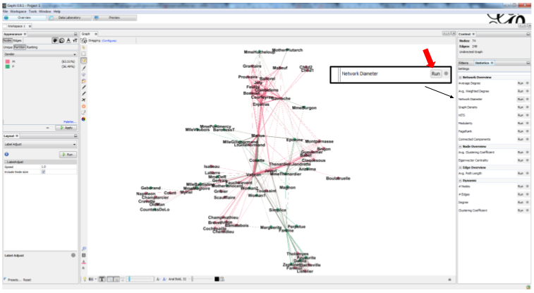
Figure 20. Computing betweenness centrality


This will open a window with parameters (explained in a more advanced tutorials). Click "OK":

Parameters for the computation of betweenness centrality
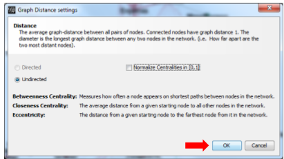
Figure 21. Parameters for the computation of betweenness centrality


A report window opens (also explained in a other tutorials). Close it.

Report after the computation of betweenness centrality
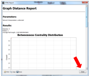
Figure 22. Report after the computation of betweenness centrality


Now we can visualize this information.

visualize attributes created by Gephi

Gephi has computed for us the betweenness centrality of all nodes. This remains invisible on the network, however.

It would be interesting to, say, resize the nodes according to their centrality: the more central a node, the bigger. This would allow for a very quick visual appreciation of which nodes are the most central.

First, let’s switch to the data laboratory to see how Gephi stored the "betweenness centrality" of each node:

Switching the view to the data laboratory
Figure 23. Switching the view to the data laboratory


When we ran "Network Diameter" in the statistics panel, Gephi has actually computed many kinds of centralities (not just "betweenness centrality"):

Different centrality measures visible in the data laboratory
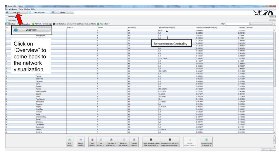
Figure 24. Different centrality measures visible in the data laboratory


To resize the nodes according to the value of their betweenness centrality, we use the Appearance panel:

Caution
make sure you select the correct options
Ranking node sizes by centrality
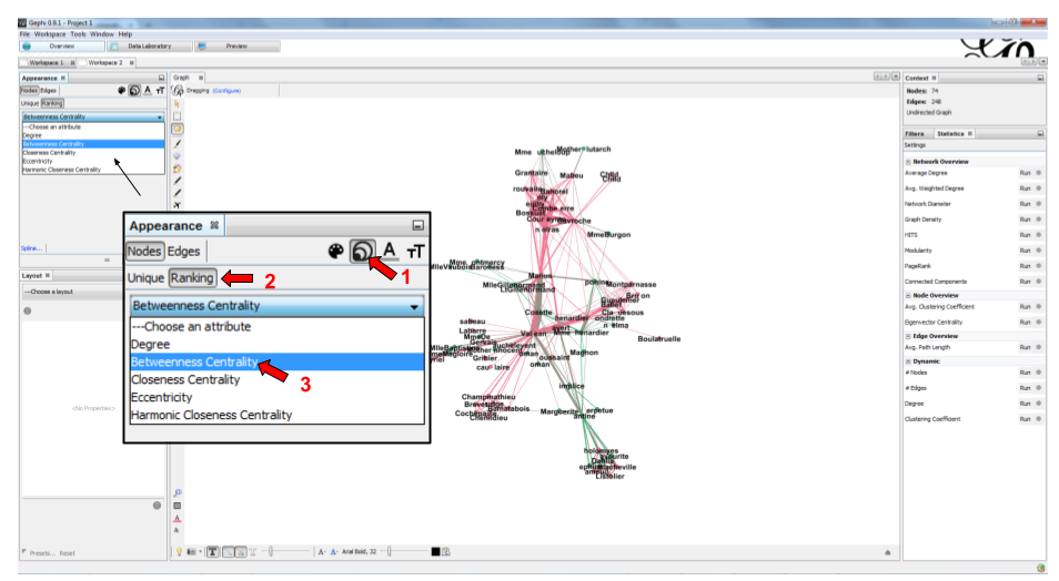
Figure 25. Ranking node sizes by centrality


Selecting the minimum and maximum sizes of nodes
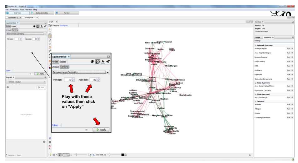
Figure 26. Selecting the minimum and maximum sizes of nodes


ranking centrality miserables 3  en
Figure 27. Result of the ranking


Resizing labels to reflect their node's size
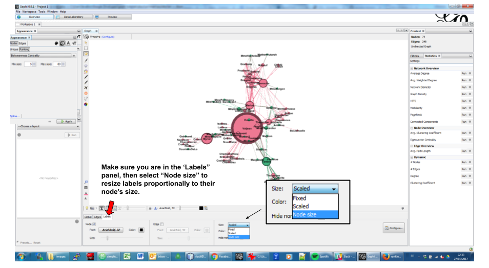
Figure 28. Resizing labels to reflect their node’s size


result label resizing en
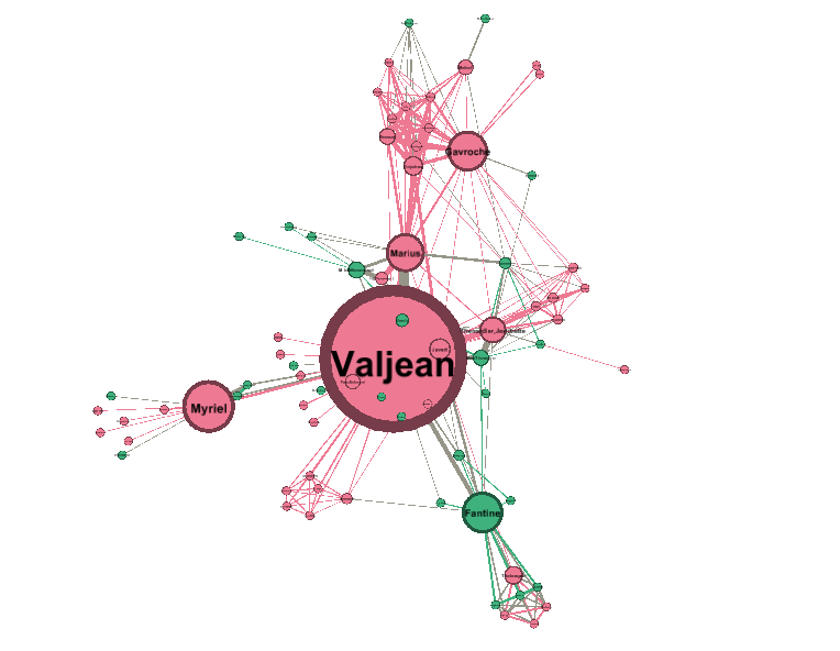
Figure 29. Result of the label resizing


exporting a network as a picture

1. exporting a screenshot from the Overview (a png image)

Open the configuration panel for screenshots
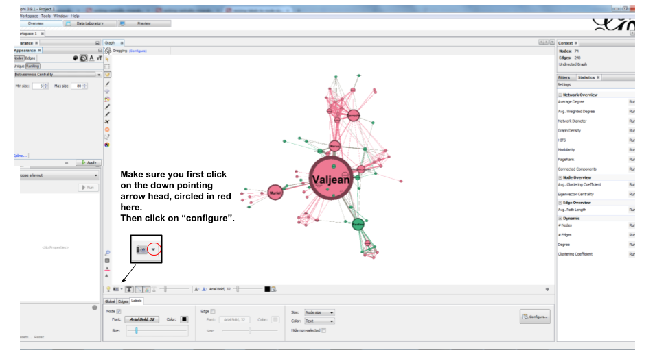
Figure 30. Open the configuration panel for screenshots


Select the maximum value for anti-aliasing, and multiply values for width and height for higher resolution. For example, resolution x 3 is width = 3072 and height = 2304

configuration screenshot en
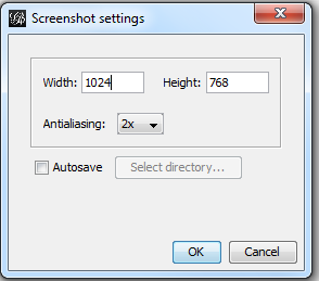
Figure 31. The configuration panel for screenshots


2. exporting a pdf or svg picture

Let’s switch to the preview panel:

Switching to the preview panel
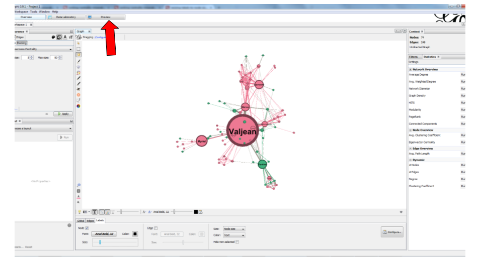
Figure 32. Switching to the preview panel


The preview panel is dedicated to the preparation of the picture to be exported as a pdf or svg, which are "scalable": in pdf or sv, the resolution of the graph will remain perfect, even with a strong zoom. But as you see, it means the network is now looking different than in the Overview.

Caution
contrary to the Overview panel, here you need to hit the "refresh" button after each parameter change.
Updating the parameters
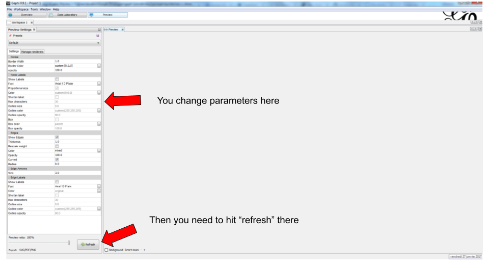
Figure 33. Updating the parameters


Here I change just 2 parameters: Show Labels and Font (which I reduce to size "5"), to get:

Result of preview
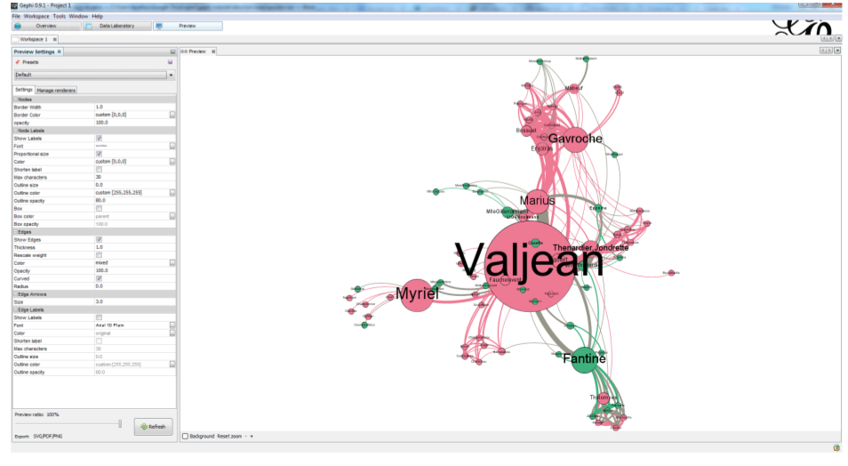
Figure 34. Result of preview


Export: just click on the button and select the file format you prefer

Export button
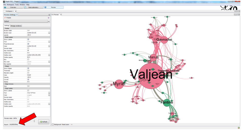
Figure 35. Export button


3. donwload the result file

download this zip file if you need to see the network in its final form.

the end

questions and exercises

  1. Open the file miserables.gexf with a text editor (here is how to do it on a Mac, and on Windows). See how the nodes and the links are written in the file. Can you find the character Javert?

  1. Our network of Les Miserables characters was undirected. Can you think of networks which are directed?

Imagine how undirected and directed networks differ when computing centrality, for example.

  1. Force Atlas 2 is a layout which brings together connected nodes, and spreads out unconnected nodes. We might have nodes with no relation at all with other nodes (called "isolated nodes").

How will these isolated nodes move on screen?

  1. When applying the Force Atlas 2 layout, the network moves quickly, then stabilizes, and then keeps moving a bit.

Can you guess why this is happening?

  1. In the list of layouts, Force Atlas 2 is just one of many options you can choose. Try "Fruchterman Reingold" and "Yfan Hu".

These are layouts which follow the same logic as Force Atlas 2, but with slight variations. Explore how these algorithms result in similar, yet specific layouts.

  1. In this tutorial, we defined degree centrality. Can you imagine a situation when a node with the largest degree centrality will actually be in the periphery of the network? You can draw a toy network to help you figure.

to go further

Visit the Gephi group on Facebook to get help,

Give a try to nocodefunctions.com, the web application I develop to create networks for Gephi. Click-and-point, free, no registration needed.

site
    stats